Making time-series charts that actually tell a story
Original: How to visualize time-series data: best practices
May 29, 2025
7 min read
Guide
Intermediate
Summary
Understand the difference between exploratory and explanatory data visualizations, and how to effectively use each type to support the data analysis workflow - from initial exploration to final presentation of insights.
Who This Is For
Business Analysts
Product Analysts
Marketing Analysts
Key Takeaways
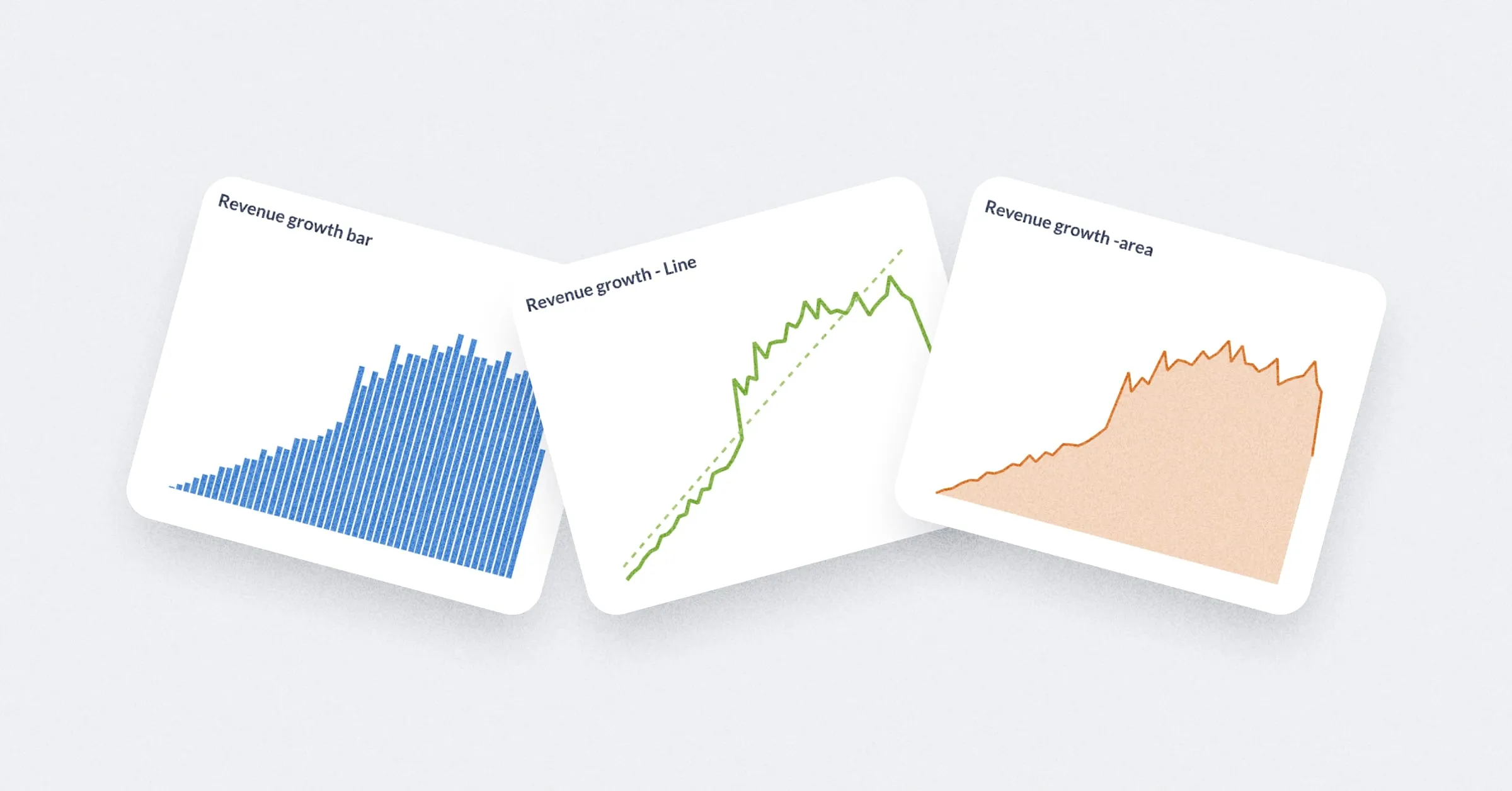
- Learn when to use line charts vs. bar charts vs. area charts based on your data structure and message
- Structure your data tables properly to match your visualization goals (comparing periods, showing trends, etc.)
- Focus each chart on communicating a single key insight rather than cramming multiple messages
- Choose chart types based on whether you want to emphasize current state, evolution, magnitude, or proportion
- Use the right data shape strategy for one metric over time vs. multiple metrics vs. breakout analysis
Tools & Technologies
Metabase Line Charts Bar Charts Area Charts Trend Charts Waterfall Charts
Topics Covered
data-visualization storytelling exploratory-analysis presentation-design
Ready to dive deeper?
Read Full Article on www.metabase.com